Does Your App Icon REALLY Matter That Much?
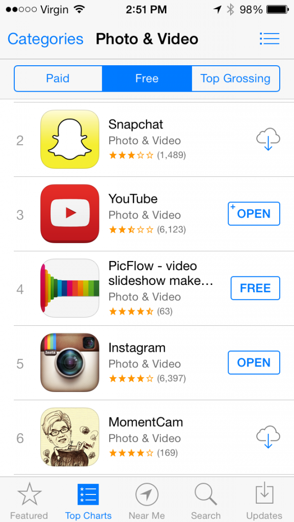
Almost everyone agrees that an app icon needs to be simple, eye-catching, beautiful, brand representative, etc. I’m not so sure after seeing the app MomentCam rise to the top of the photo and video charts in iOS. Check out their icon: 
This icon is even more bizarre when looking at it on an iPod touch or iPhone. You have to squint real close to see what the heck is going on there. I think this is getting people to download the app because they are about the #45 most download app on the iOS app store (as of Nov 24, 2013).
One of these is not like the other…
If you read the description of their app, it’s only a few lines long. There’s no fake review plugs or other marketing gimmicks to try and brainwash the user to download the app. Just a crazy icon that is bizarre enough to drive downloads. Tap the icon there to go download the app and see for yourself how bizarre it is.
Maybe my next You Doodle icon will just be a bunch of random colors and noise generated from atmospheric randomness…
 Jeff Johnson (